Field At Home
Everything started with a question...
How come farmers earn so little, yet their products are so expensive?
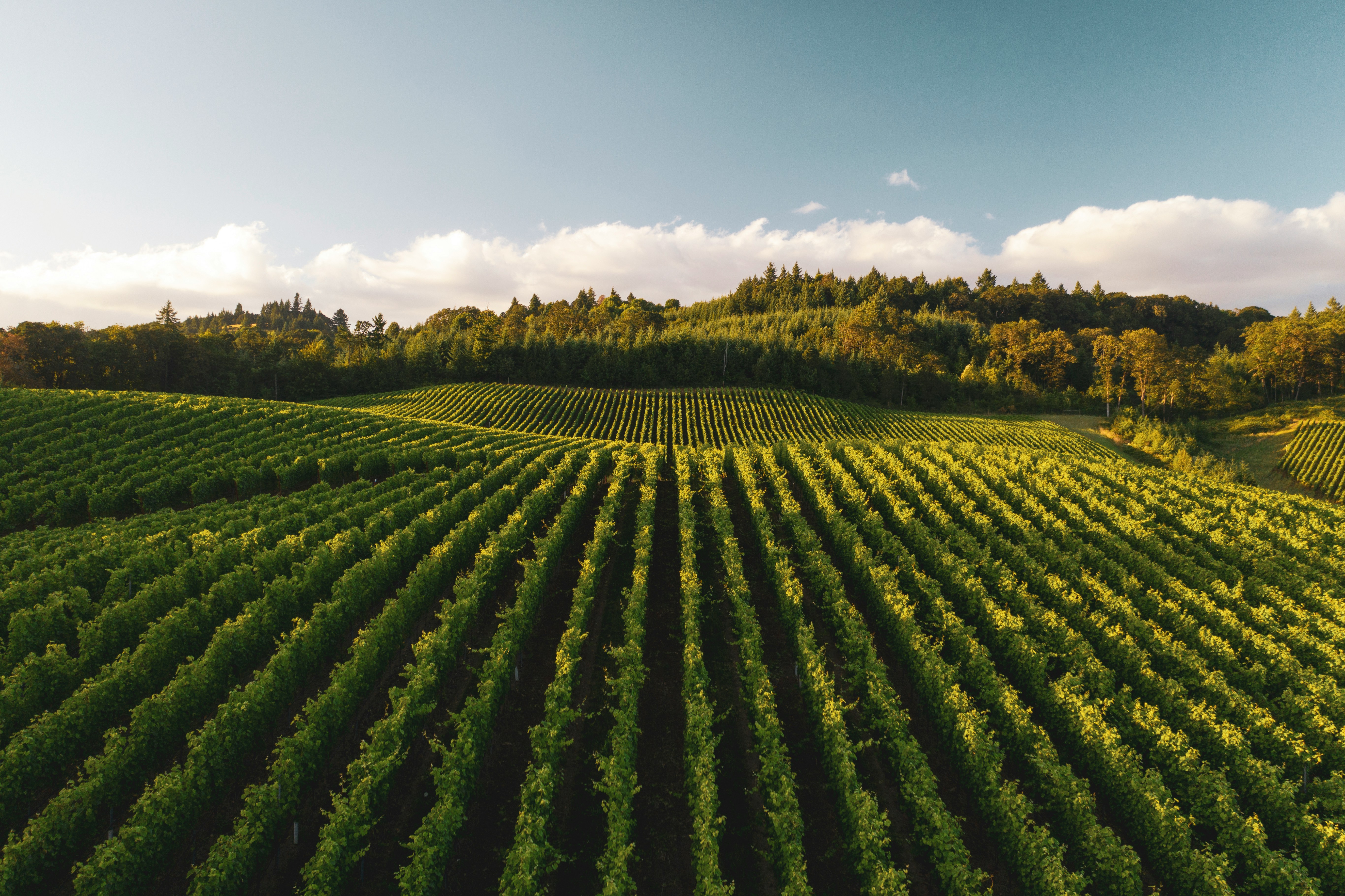
For months, news outlets plastered their front pages with images of tractors gridlocking cities. Farmers were protesting, the countryside screaming for help. As a digital designer in training, I simply couldn't turn a blind eye to that reality. That's when I decided my Final Degree Project would be more than just an academic exercise. It would be a tangible tool. A bridge connecting growers and consumers.


The challenge
The goal was to build an app that directly linked farmers and consumers, eliminating intermediaries. This would guarantee fair pay for producers and fresh products for the end-user. However, this wasn't just a tech challenge. We also needed to change consumer habits, foster trust in buying fresh goods online, and tackle numerous logistical, emotional, and economic hurdles.
The user experience had to:
Instill confidence when buying fresh products sight unseen.
Streamline the navigation and purchasing flow.
Cater to diverse user profiles and varying degrees of digital proficiency.
Address the challenge of high delivery fees.
The approach
Adopting a human-centered strategy, Design Thinking formed the core of this project. The key phases included:
Meeting my users
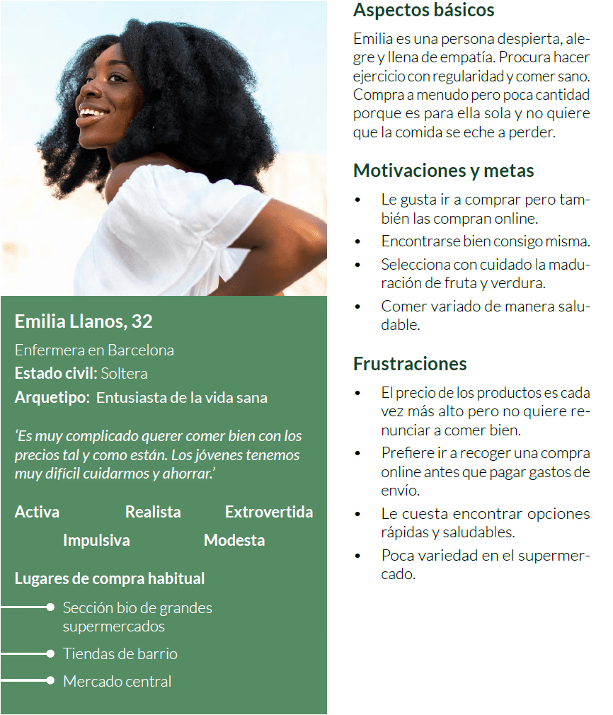
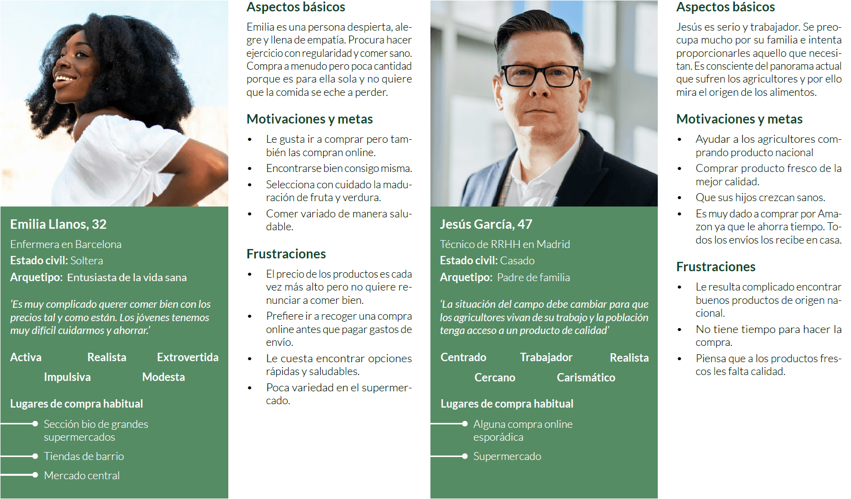
Emilia (32, Barcelona resident) loves healthy eating but despises food waste. She's open to trying new solutions, provided they are both practical and cost-effective.
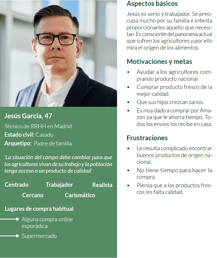
Jesús (55, family man) strives to give his family the best. He's particular about the origin of his food. With limited time and significant responsibilities, convenience is key for him.
What they share is a desire to support local agriculture, but they both require assurances.
Research with purpose
Following 200 surveys and 3 in-depth interviews
95% consider it vital to support the agricultural sector.
Over 80% of people have never purchased fruits or vegetables online.
Their primary hurdles? Steep shipping fees and concerns about product quality.
Yet, amidst this, I discovered a glimmer of hope: people are ready to shift their habits... provided they're offered a compelling reason.
The concept: Field at Home
" height="40px" id="bXQomDYQy" width="40px"/><path d="M 7.799 3.185 L 9.055 0 L 4.481 0 C 3.14 0 1.919 0.945 1.311 2.443 L 0 5.668 L 4.614 5.668 C 5.964 5.668 7.201 4.703 7.804 3.185 Z" fill="rgb(64, 90, 36)" height="5.667650000000323px" id="Npbesj8tA" transform="translate(19.699 4.718)" width="9.055333333333351px"/><path d="M 3.304 4.214 L 6.736 4.214 L 5.762 1.815 C 5.312 0.702 4.397 0 3.403 0 L 0 0 L 0.935 2.369 C 1.38 3.501 2.3 4.219 3.309 4.219 Z" fill="rgb(64, 90, 36)" height="4.218574999999875px" id="trwTLOPjP" transform="translate(11.89 8.279)" width="6.73591666666664px"/><path d="M 7.979 0 L 0 8.559 L 3.23 11.571 L 11.209 3.011 Z" fill="rgb(64, 90, 36)" height="11.57058333333303px" id="C8UJDMWNP" transform="translate(5.835 19.79)" width="11.209291666666616px"/><path d="M 0 0.005 L 0 10.712 C 1.543 10.425 3.022 9.965 4.416 9.347 L 4.416 4.149 L 0 0 Z" fill="rgb(64, 90, 36)" height="10.712166666666384px" id="ch0ci55Gu" transform="translate(23.661 28.947)" width="4.416416666666805px"/><path d="M 0 4.728 L 0 9.219 C 1.395 9.871 2.873 10.371 4.416 10.687 L 4.416 0 Z" fill="rgb(64, 90, 36)" height="10.687416666666358px" id="nsLSJHW_u" transform="translate(11.538 28.902)" width="4.416416666666748px"/><path d="M 3.011 0 L 0 3.23 L 14.807 17.033 L 17.818 13.803 Z" fill="rgb(64, 90, 36)" height="17.033166666666737px" id="HK5KsSSKU" transform="translate(16.344 14.327)" width="17.818166666666627px"/></g></svg>)
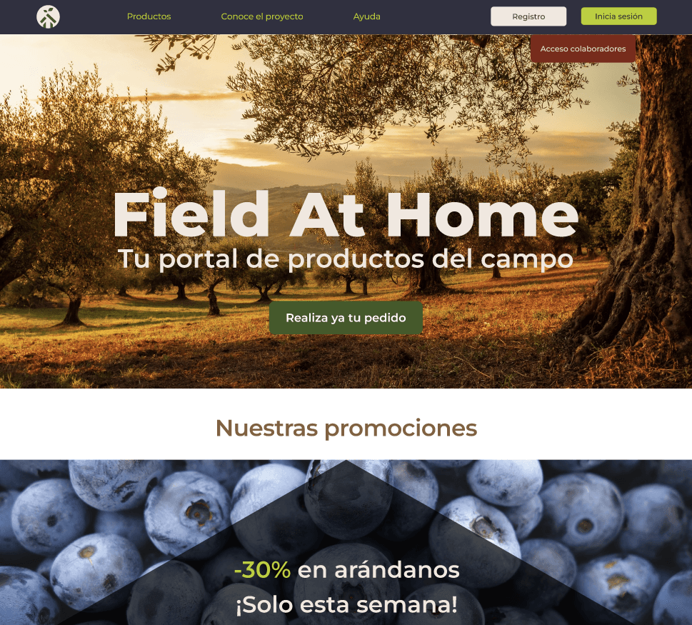
We crafted a name, 'Field at Home,' which is a playful blend of 'Field' (campo) and 'Feel at Home' (siéntete como en casa).
It instantly conveys closeness, quality, and a sense of warmth. Our visual identity draws from natural earth tones, greens, and reds.
The logo features a house adorned with leaves, symbolizing the harmony of home and nature.
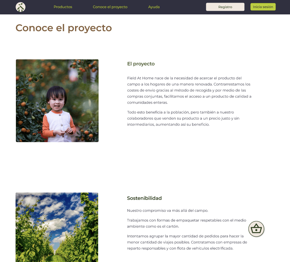
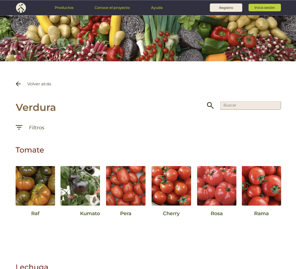
The digital solution
I developed a responsive web platform — opting for a single, adaptable solution instead of two separate products — featuring these key functionalities:
Catalog with smart filters (origin, ripeness, organic, etc.)
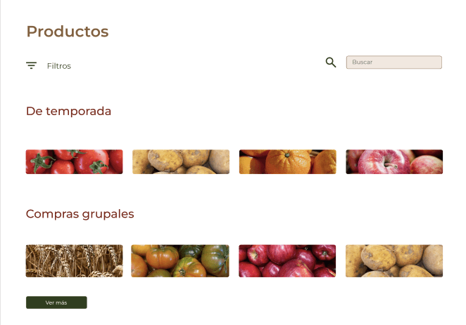
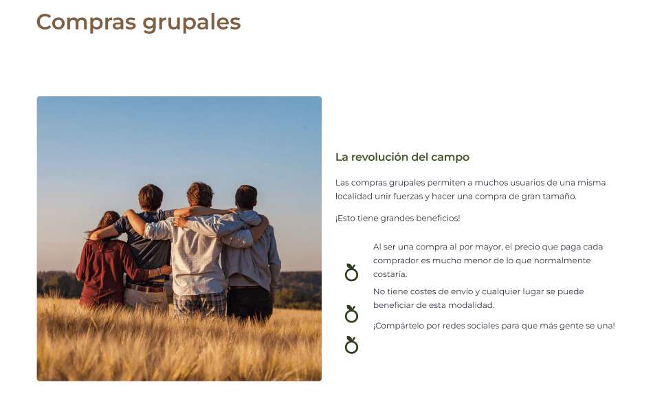
A dedicated group buying section designed for associations and families.
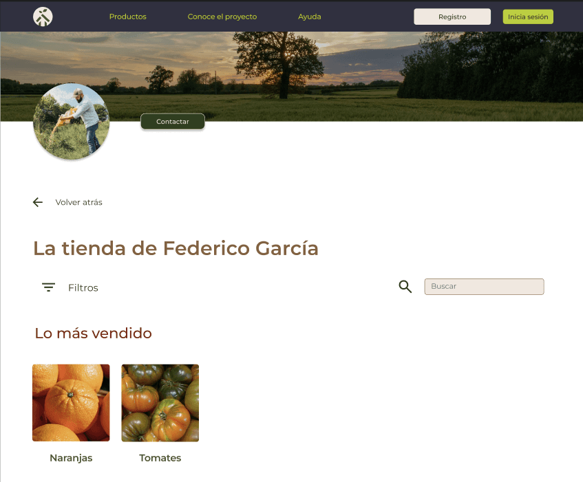
Detailed product pages including a photo of the farmer.
The option for refrigerated locker pickup to offer flexible collection.

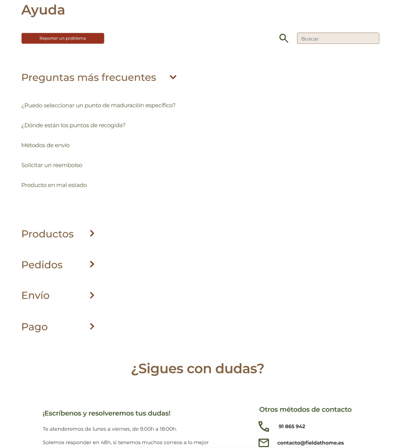
A comprehensive FAQ page to address common questions from new users.
Testing with real users
I developed a functional prototype in Figma and put it to the test with users, including Emilia and Jesús. Here's what we found:
Users praised the design's clarity and warmth.
They recommended adding more details about the farmers (a suggestion I incorporated!).
They validated that refrigerated lockers were indeed an excellent idea.
They requested an easy method for setting up recurring orders.

Beyond aesthetics: strategy
Drawing inspiration from Freshis, a local benchmark, and Pinduoduo, a key Chinese business, I deliberately chose not to mimic their emphasis on urgent delivery. Instead, I championed a sustainable, consolidated shipping model: 24-48 hour deliveries to optimize routes and cut down on costs. Furthermore, I made sure to steer clear of common pitfalls present on their platforms, including:
Missing information
Poor readability
A failure to foster an emotional connection with the product
What I learnt
This project truly showed me that design isn't just about aesthetics. It's an iterative process of listening, researching, failing, refining, re-testing... and then listening again. Each screen, button, and user flow was intentionally designed to bridge gaps between people who would typically remain disconnected.
Used tools


Summing up
Field at Home is more than just an app. It's a vision for changing how we eat, how we buy, and how we interact with our farmlands. 'If the fields can't come to our homes... then let technology bring our homes to the fields.

View from 2025
I absolutely loved working on this Final Degree Project; it was my true entry point into the UX/UI world. Reflecting on my professional journey since then, it's incredible to see how much I've evolved. Revisiting this project now highlights numerous design areas that need refinement. While the UX still holds strong as a foundation, the visual execution falls short. That's why I'm eager to give it a fresh look, enhance it, streamline it, and even incorporate elements I couldn't complete before due to time constraints, like a mobile version.