View the tag documentation
Product context
Front Office is B2B management software for the logistics industry. It has dense tables, many modules and submodules, and a variety of clients who use it.
The request
A front-end developer came to me with a request they had received from the projects team. The request asked for multi-colored tags to be added to the substatus column of an orders table, which until then had been plain text. The request came with an attached image of a table generated with AI.
What were the problems with that image?
- The colors were very varied and had no specific meaning. Teal greens, dark blue, aubergine…
- In the future new substatuses could be added, and they would want colors applied to those new cases.
- The suggested colors didn’t exist in the component or in the system.
Front end suggested two options:
New color variants
It would mean creating many of them, and the logic behind how the component is used would be lost.
A customColor property
It would allow any color to be used, bypassing the tokens, with no contrast guarantee and no control from design.
Neither of them solved the problem. Whether the table would use tags was not up for discussion; the challenge was how to apply them so that the component kept making sense and every new substatus didn’t bring a new color with it.
How the tag is designed
The tag has always been used as a signal to highlight information or to communicate status. It has no hover or pressed states because it is not an interactive element.
Main features:
- 5 semantic states that use color to always convey the same meaning: info, success, warning, error and neutral.
- The icon can be hidden, since it only reinforces the meaning when needed.
- 2 sizes: a small one for data-heavy tables and a default one for detail views.
- Tokenized component, to make front-end integration easier.
- Guaranteed contrast and built-in dark mode.
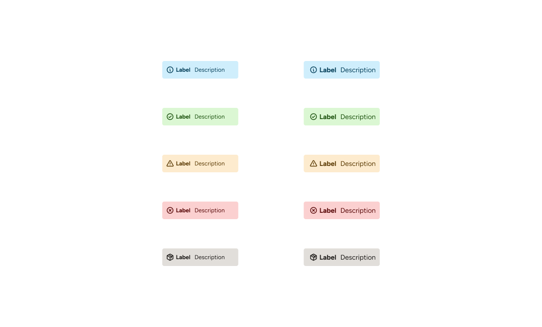
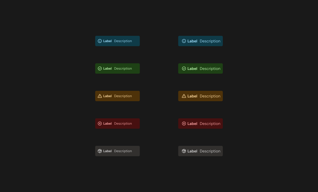
Adding colors without a meaning breaks the way the component has been used.
The solution
After thinking it over, I decided the component should stay exactly as it was. The solution was to assign each substatus a color according to what it means to the user. Is everything going well? Success. Is there an error? Error. Does it need attention but isn’t critical? Warning. Is it purely informational? Info.
This way, scalability is guaranteed. When new substatuses are created, you only have to decide which state they belong to. No need to invent anything.
It was also a relief for the developers, since they didn’t have to touch the component, and the request was still fulfilled effectively.