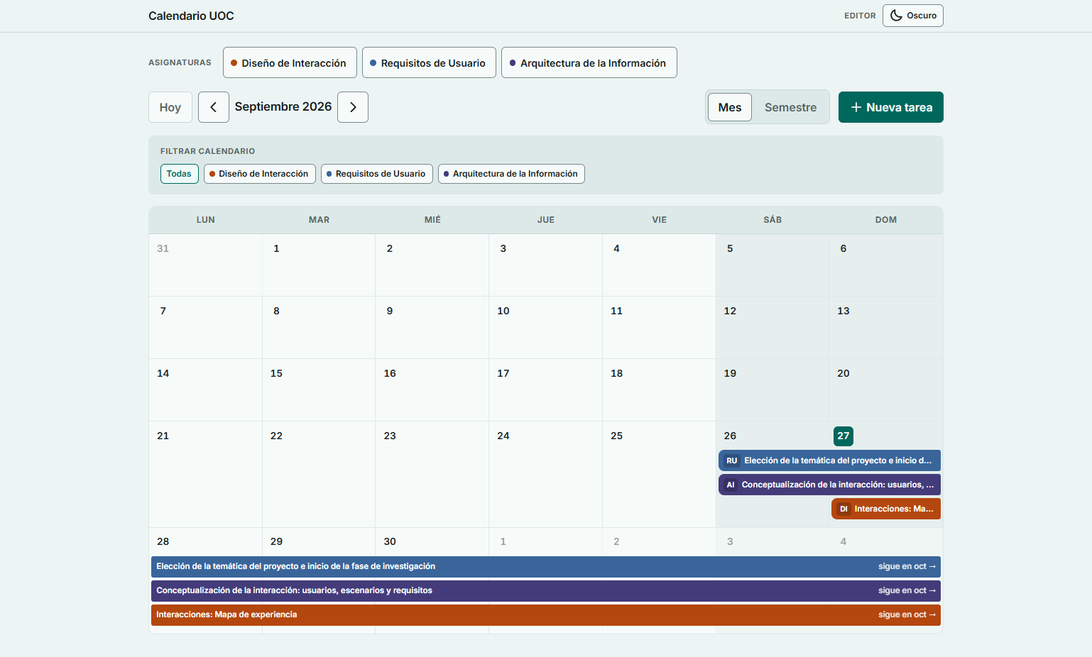
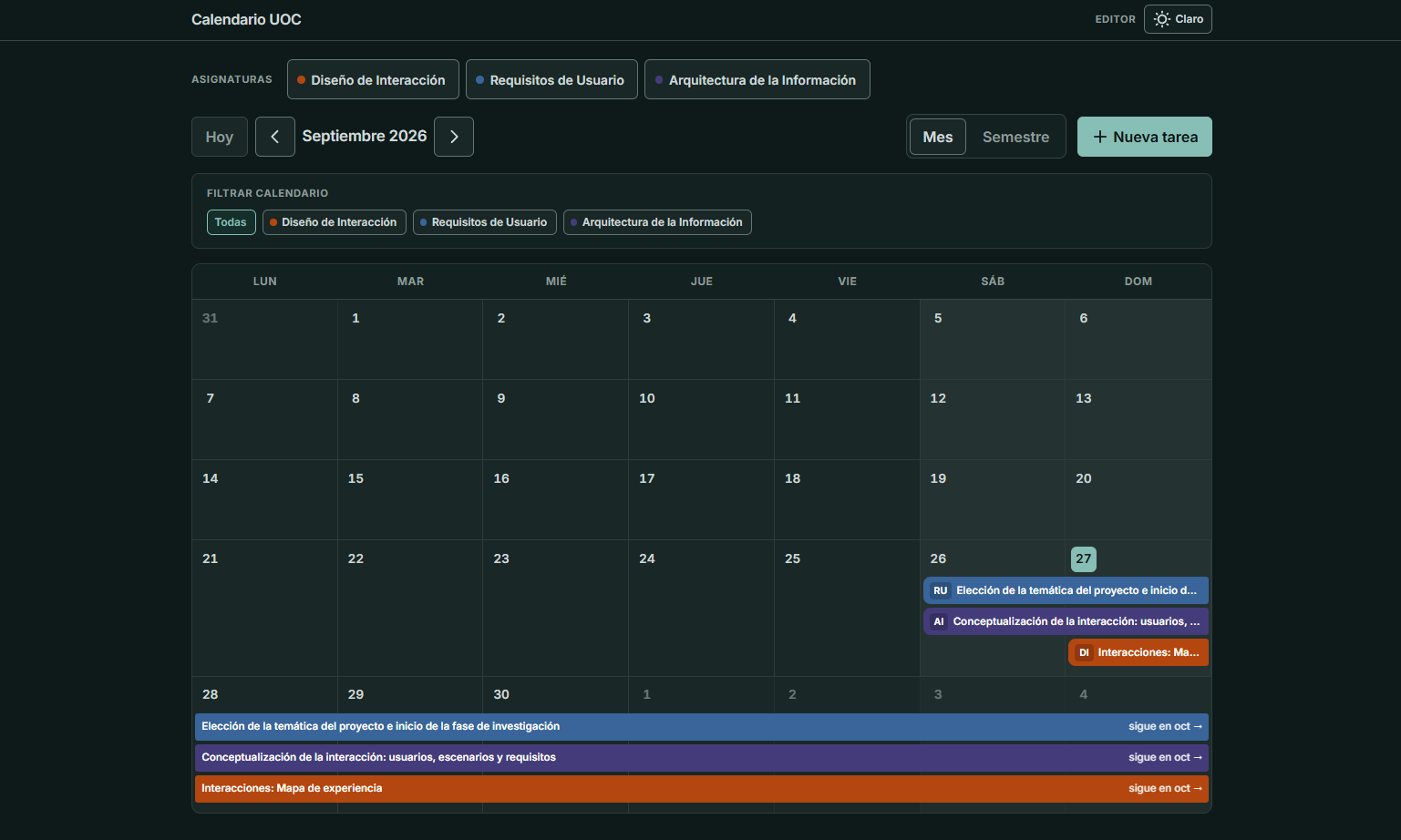
If you’ve studied across different online campuses, you know how chaotic they tend to be. You can’t find what you need — everything is scattered across a thousand places.
Visit the calendar tool
If it doesn’t exist, I’ll build it
When I did my graphic design degree, I already struggled to know when an assignment started (now they’re called challenges) and especially when it ended. On top of that, challenges are often long (they last 20 days), they have several parts, and it’s easy to miss something. Everything lives in different places: challenge descriptions on one side, resources on another.
I looked for tools that would let me stay organized and mark a clear start and end. None worked the way I wanted, or you had to pay for that feature.
Two years ago, AI wasn’t as advanced as it is today. This time I didn’t hesitate, and in two evenings I built my own tool.
It’s the first tool I’ve made that has a back end. I’ve always had a lot of respect for the back end, because that’s where security really matters and where sensitive data lives. This tool doesn’t hold much of that kind of data, but I still had to lean on AI for guidance there.
The back end is Convex, an open-source back-end tool. I hadn’t heard of it until then. Given the scale of my tool, I decided to trust it.
Iterating on the tool
That’s how a calendar of my own for managing those challenges came about.
A tool built for day-to-day master’s life: create tasks, edit tasks, add objectives.
It’s far from perfect. It’s shaped around my needs, and even though I’ve iterated a lot, it still has traces of that AI-generated design.
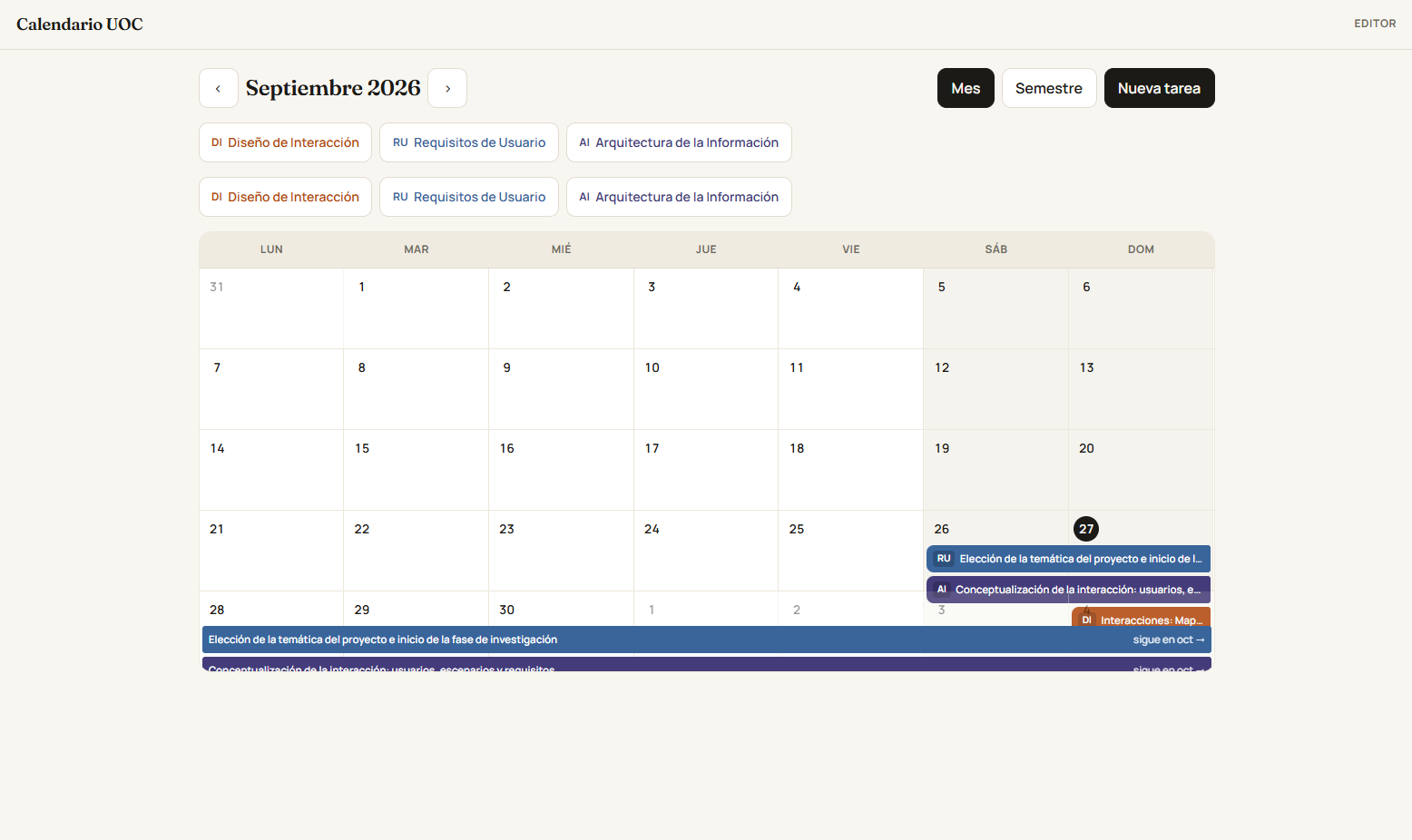
As you can see, the calendar was broken and had a few design problems: numbers stacking on top of each other, course buttons that looked like filters, filters mixed with actions… A mess.
On top of that, the forms to create tasks jumped out as a window prompt, field by field. Picture those native browser pop-ups that say: course. You enter the course, hit OK, and another identical window appears for the next field — the task name. Nobody can stand that.
As a digital product designer, I couldn’t let that slide. So the form moved into a full modal, and later, as it grew, I shifted editing to a full page.
Some things you have to suffer yourself to realize how badly designed they are. For example: the button to add a resource sat next to its matching title.
You’d add a new resource, the list grew, and the form you had to fill in drifted farther and farther from the button to add another one.
I decided that couldn’t stay that way. Constantly scrolling just to create a new resource was creating a lot of frustration.
Now the create-resource button sits underneath.
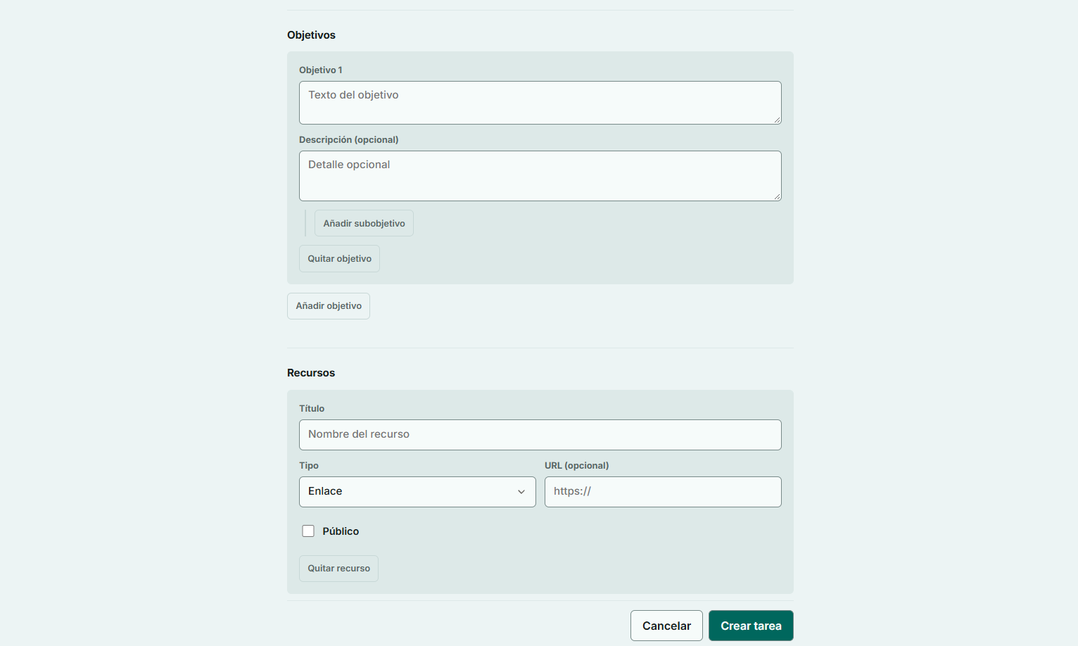
The result
I still have things to improve.
I already have the first activities registered; I still need to work through them so I can complete objectives and see how the app behaves.
I’ll keep changing the production version, so what’s shown in the images here may become outdated.
If you want to see the app and try it, you can do that at the start of the post. Nothing of what I have changes — I’ve made sure of that.